Quintessential

Logo Refresh and Brand Guidelines for premium fashion brand


Project Brief
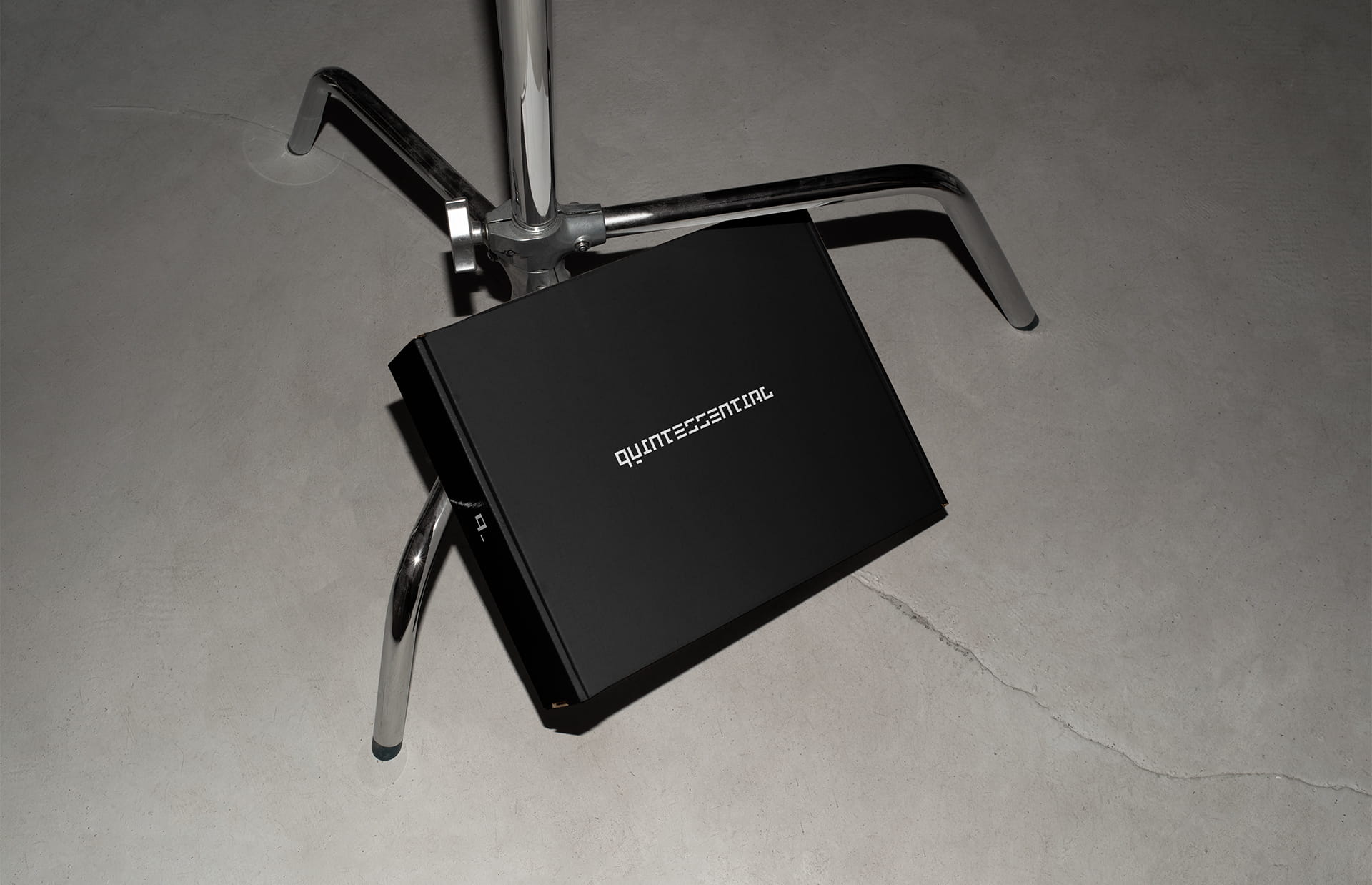
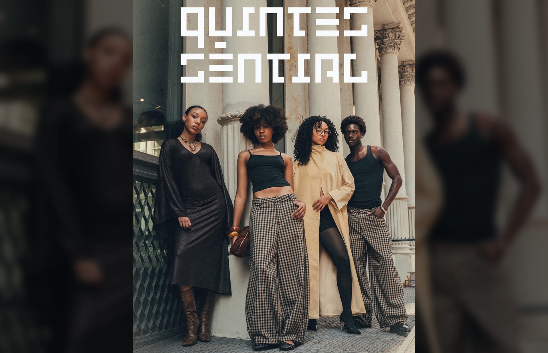
Quintessential fuses luxury craftsmanship with the energy of street culture, creating wardrobe staples that feel equally at home on city sidewalks and the runway. Ahead of their Fall line launch, they needed to expand their existing brand identity, just a logo, into a complete visual guide including building out a full logo suite, refined typography, defined color palette, and photography guidelines to ensure every touchpoint carried the same elevated aesthetic.
Obstacles
With only a rough logo in place and no established guidelines, visual consistency was at risk as they moved toward launch. The project also came with a tight timeline, requiring a highly focused approach to deliver essential brand assets without sacrificing depth or cohesion.
Approach
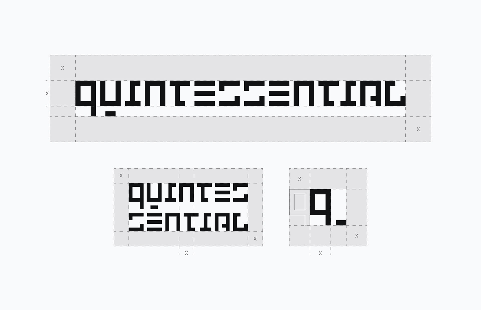
I began by sending a detailed questionnaire to capture Quintessential’s mission, purpose, values, and target audience. This informed an early moodboarding phase focused on defining a photography style that could bridge their luxury-meets-street positioning. From there, we aligned on a typography system that balanced sophistication with edge, and I refined the existing logo into a full suite of variations, including stacked and submark formats. Working in Figma, Illustrator, and Photoshop, I developed comprehensive brand guidelines covering tone of voice, logo usage, typography, color palette, photography direction, and packaging examples, ensuring the identity could flex across both digital and physical applications.